Editorial hero
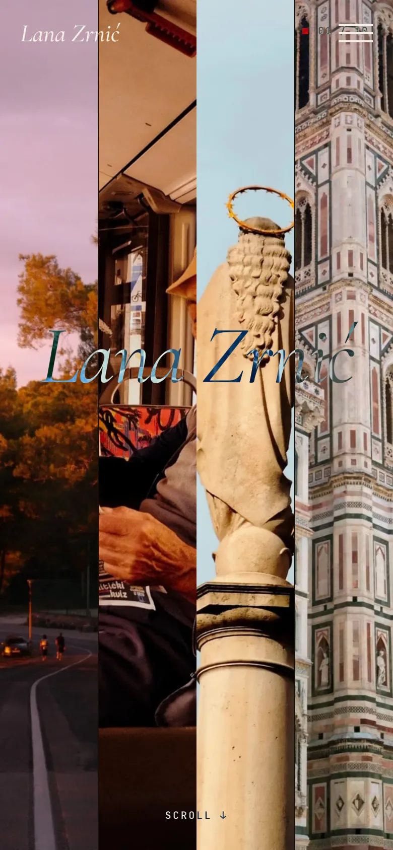
The first screen uses photos as a stage curtain, with the photographer's name across the frames and minimal navigation.
A photography portfolio set up as a gallery experience, not a catalogue. The focus is on large photos, a calm pace, curated sections and a contact flow that leads the client towards a portrait session.
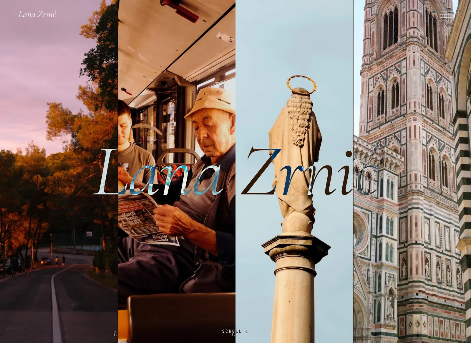
A photography portfolio has to introduce the photographer quickly, without spending the photos too fast. Instead of a classic thumbnail grid, the page opens the work through vertical frames, large transitions and sections that read like small photographic acts.
We took special care that the interface never drowns out the work. Typography, menu, contact and lightbox stay in the background, while the photos carry the first impression and the pace of browsing.
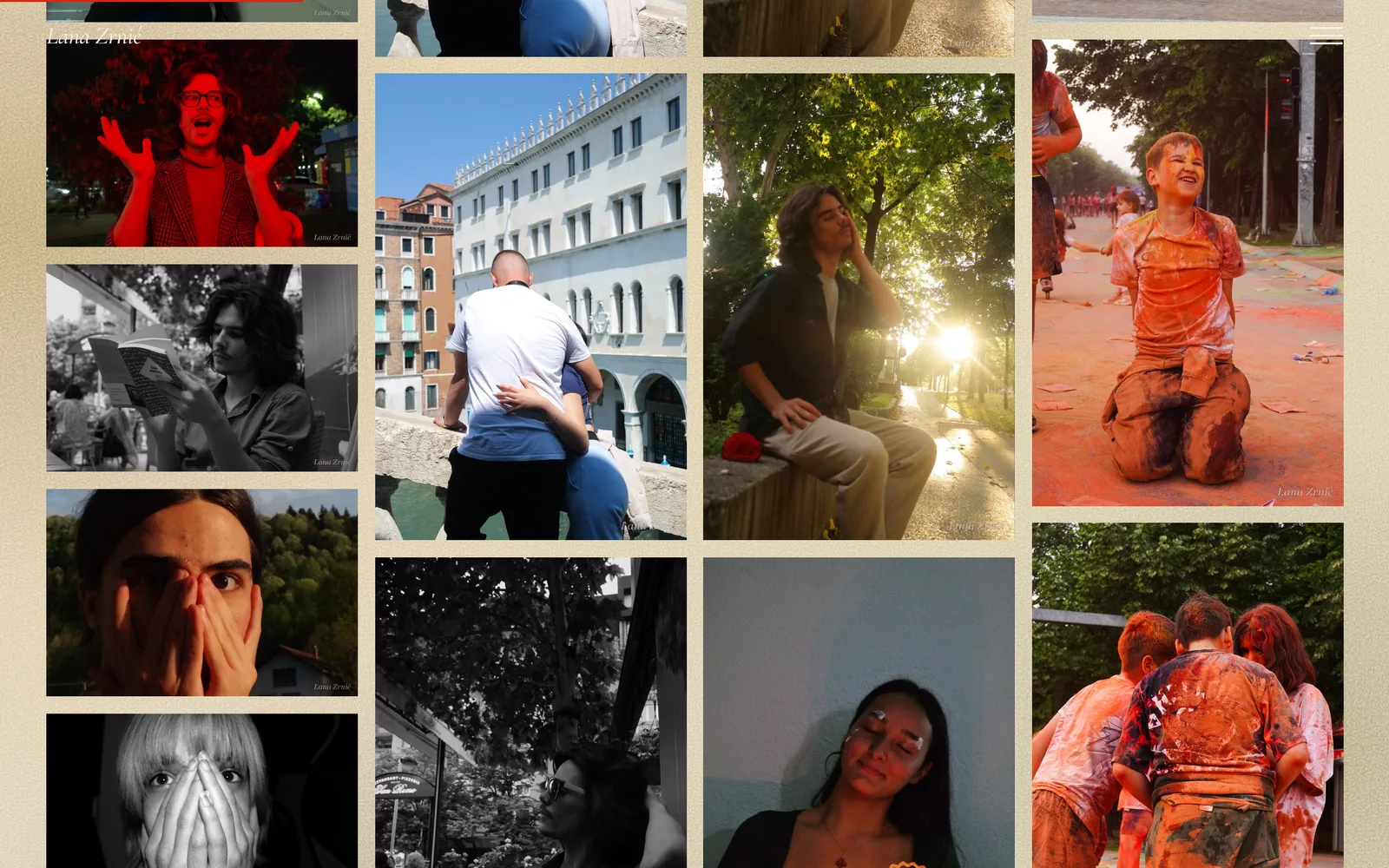
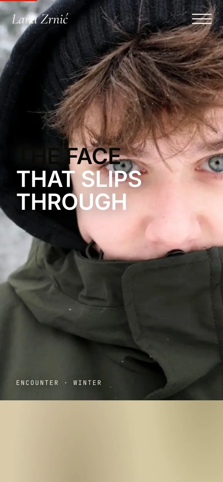
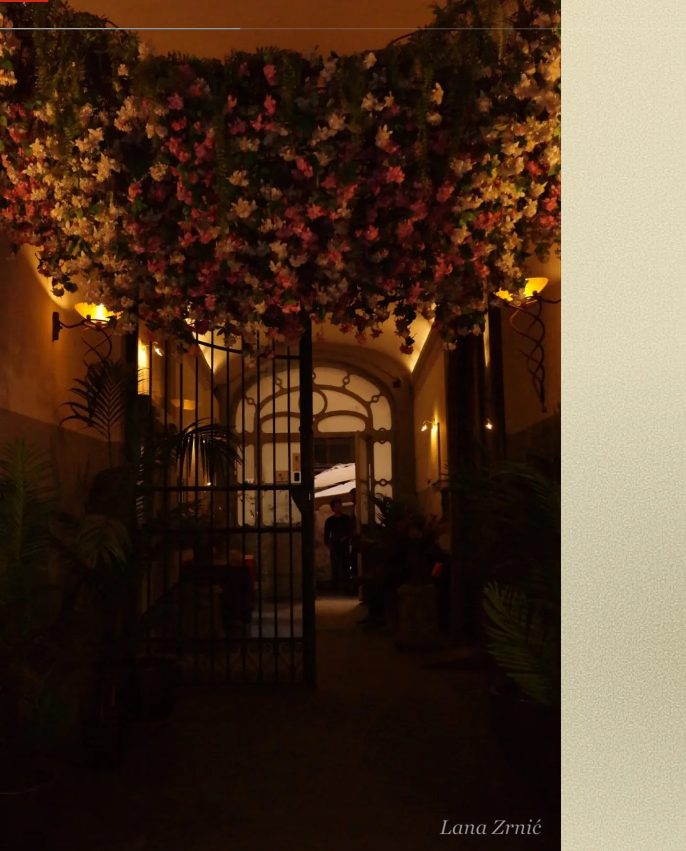
The hardest part of a portfolio isn't showing the photos, it's knowing when to stop. The interface is reduced to a few gestures: name, menu, counter and contact. No decorative elements compete with the image.
The typography is quiet and only as large as it needs to be, white space carries the rhythm, and colour comes only from the photographs. The goal is for visitors to remember the work, not the website, and still know how to book a session when they reach the end.
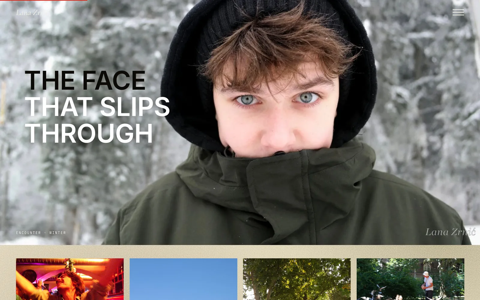
The first screen uses photos as a stage curtain, with the photographer's name across the frames and minimal navigation.
The work is grouped into clear narrative sets, instead of everything being reduced to an endless grid.
Photos can be viewed in full focus, with location, year and title, free of extra visual noise.
The contact section is direct and commercially useful, but keeps the portfolio's tone and doesn't turn the page into a sales landing page.
The interface is reduced to gestures: name, menu, counters and contact. Everything else serves the photography.
Transitions feel like leafing through series, yet stay slow enough to give the photos weight.
The portfolio ends with a clear call for portraits and collaborations, without breaking the artistic tone of the page.
Website anatomy
The portfolio is reduced to a few precise components; each serves the photography, none competes with it.
Photos as a stage curtain, with the photographer's name across the frames.
Work grouped into narrative acts instead of an endless grid.
View in full focus with title, location and year.
Layout built around portrait orientation and large transitions.
Slow, quiet transitions that give every photo weight.
From a single column on mobile to a gallery layout on desktop.
Photos load on demand to keep things fast on mobile.
Compression and modern formats with no loss of impact.
A direct call to action for portraits and collaborations without breaking the artistic tone.
Titles, descriptions and preview cards for sharing work.
A discreet index through the sections, in the spirit of a printed editorial.
Calm, large typography that lets the image set the rhythm.